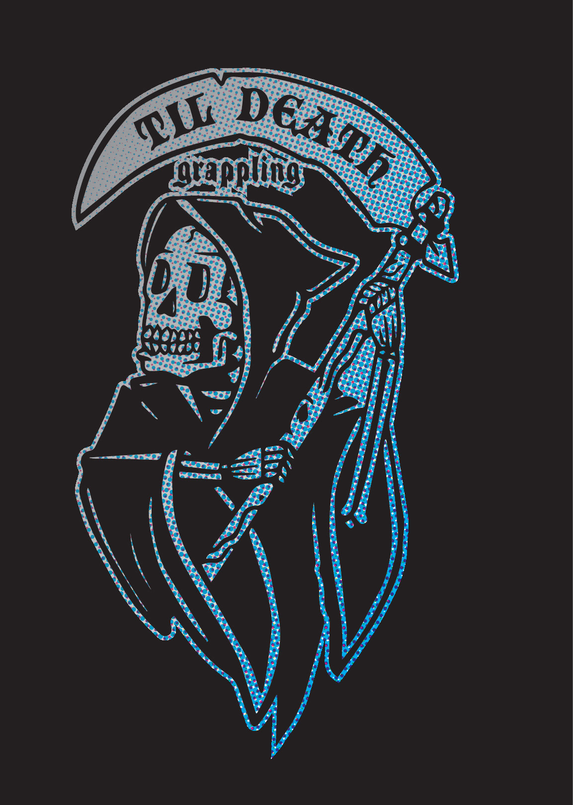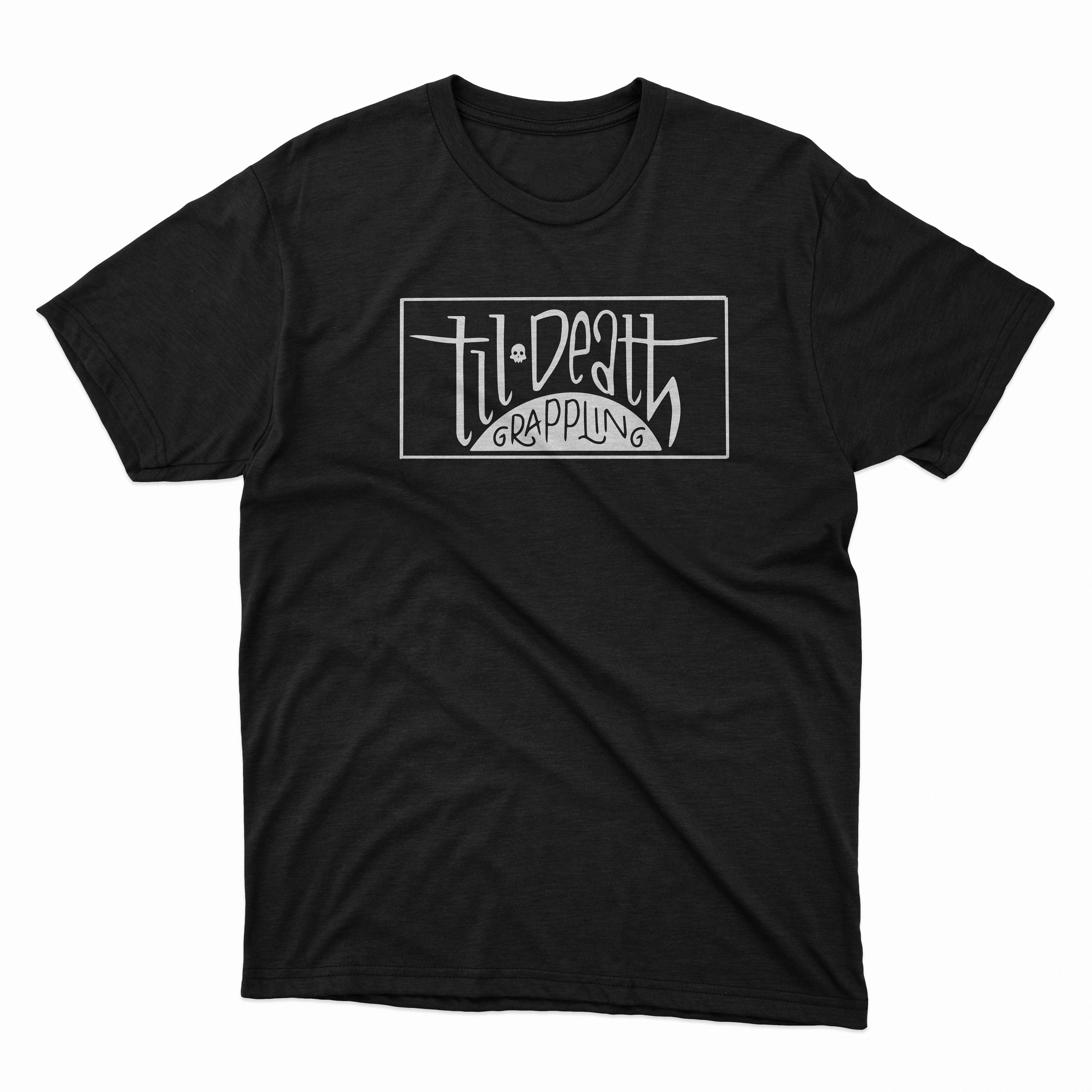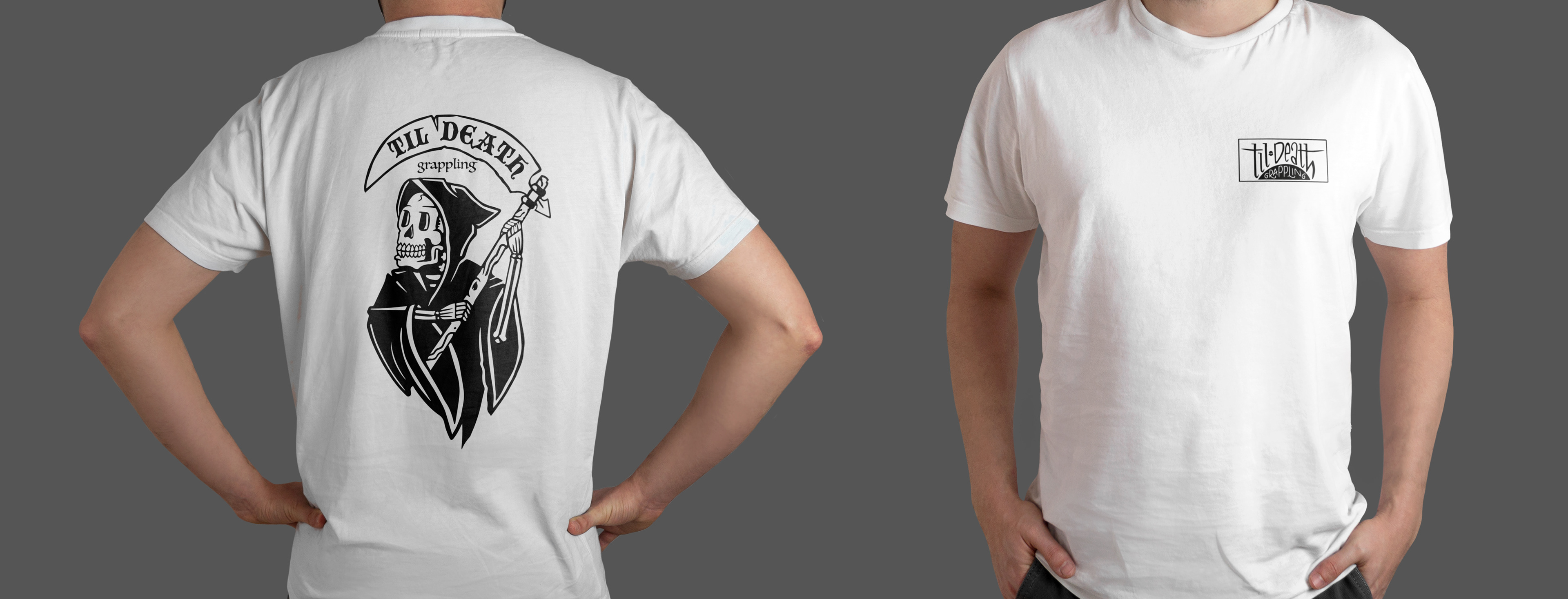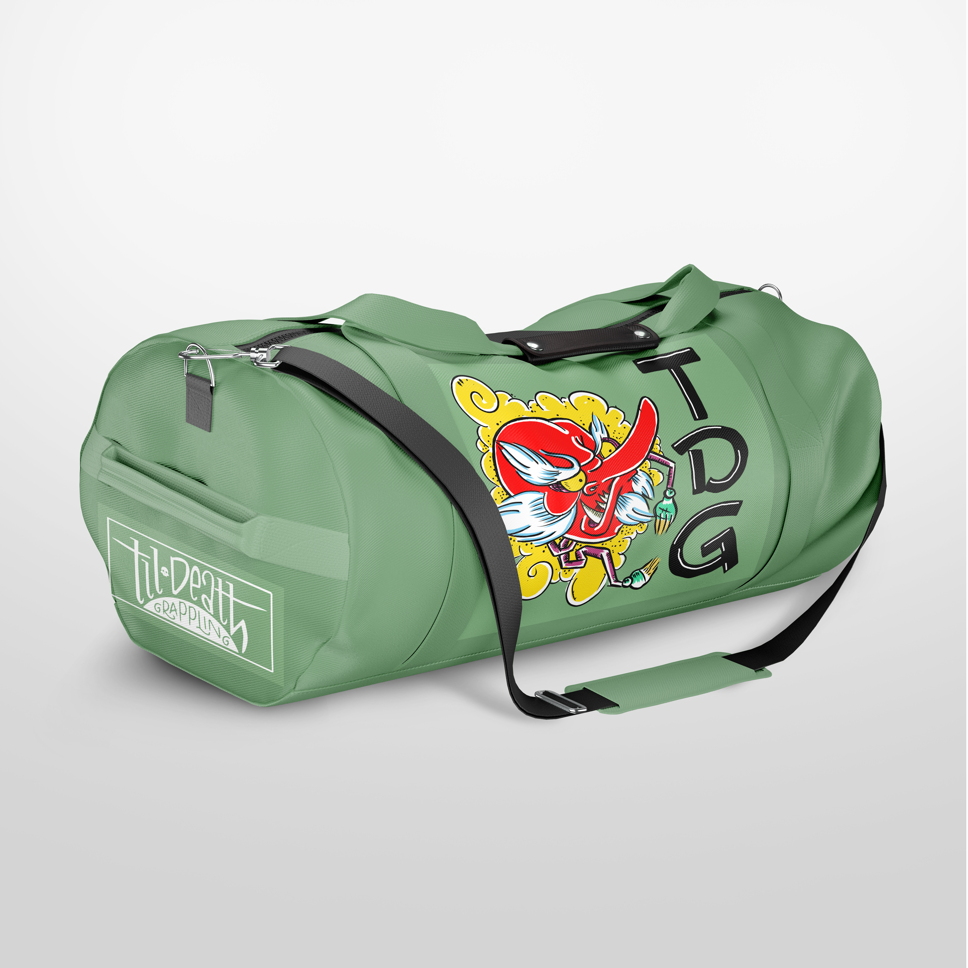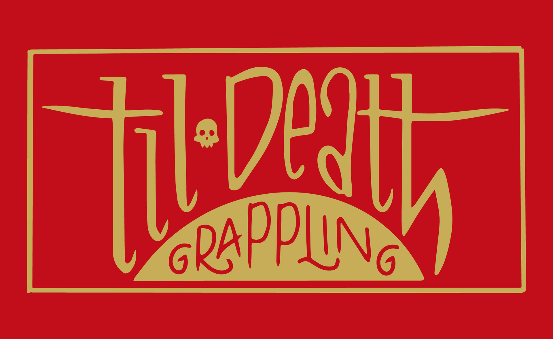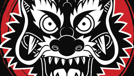
Til Death Grappling is an apparel brand rooted in the jiu-jitsu community, drawing inspiration from the sport’s intensity, dedication, and culture. The brand name evokes loyalty, resilience, and the close-knit bonds formed in the sport.
I created the branding identity, which included the design of multiple logo variations to be used across apparel, merchandise, and digital platforms. The goal was to merge the brand’s bold name with imagery that resonates within the jiu-jitsu world, and keeping the brand clean, wearable, and instantly recognizable.
Each design element was crafted to be versatile enough to appeal to a wide range of athletes and enthusiasts within the combat sports community. The final identity system gives the brand flexibility across product lines while maintaining a strong and cohesive visual presence.