Dragon Skin Jerky is a Phoenix-based brand offering premium, Japanese-style beef jerky made with 100% grass-fed American beef and infused with authentic sake and rare Japanese spices. Inspired by the founder’s family connections to Japan and a passion for culinary craftsmanship, the brand blends elements of the East and West.
I designed the logo and helped develop the overall brand identity, which captures the boldness of the product while honoring its cultural roots. The identity combines a modern aesthetic with nods to traditional Japanese design, to make Dragon Skin Jerky a standout in flavor and presentation.
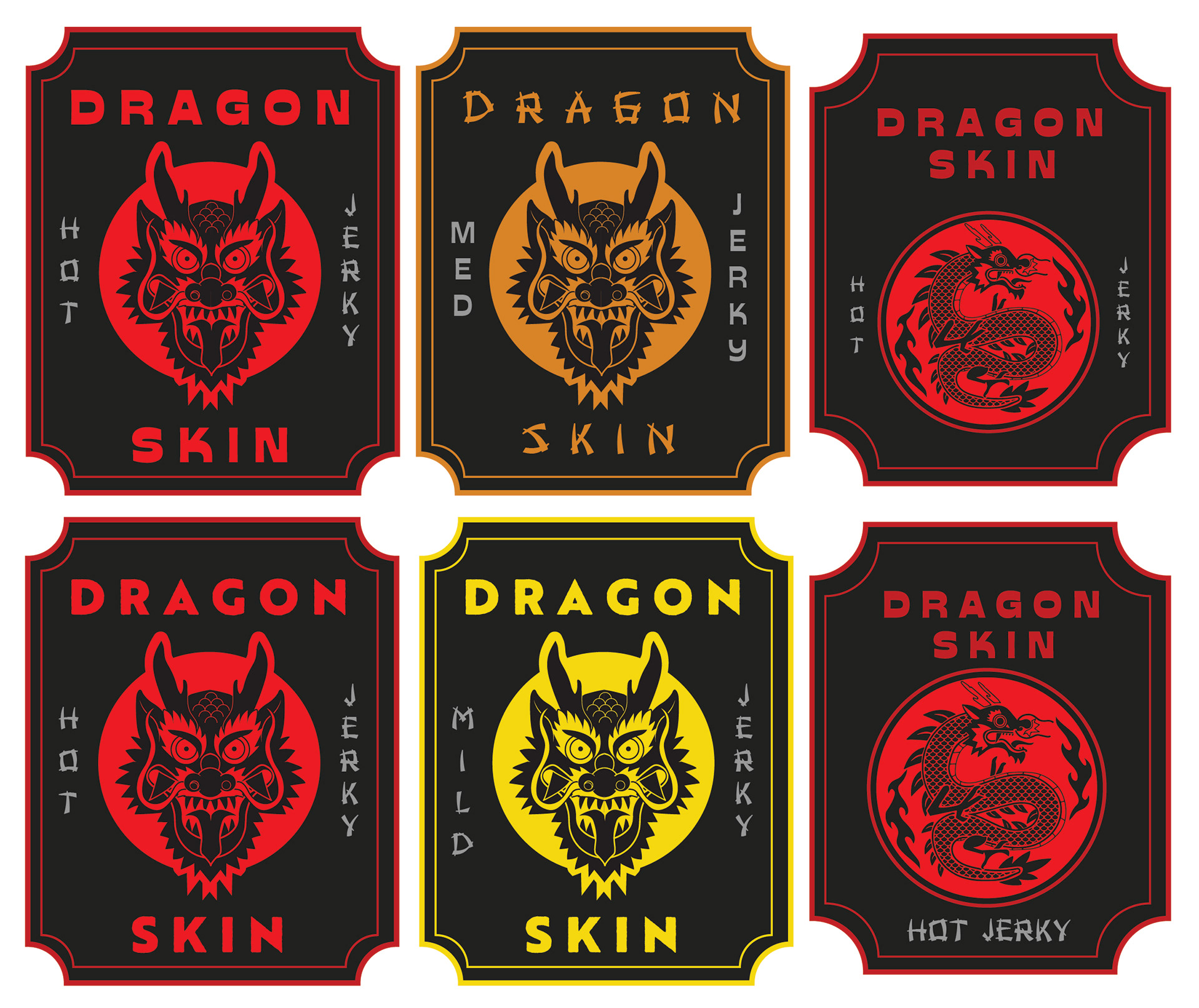
Initial Packaging Samples – First-Run Prototypes
These printed packaging samples were produced as part of Dragon Skin Jerky’s first batch, primarily for promotional use at local food festivals and community events. The goal was to introduce the product to friends, coworkers, and early supporters while testing initial reactions to the brand.
The designs retain a handcrafted, small-batch feel, emphasizing the authenticity and premium nature of the jerky. This phase served as thel first step in translating the brand identity into physical packaging that would resonate with both casual buyers and discerning food enthusiasts.


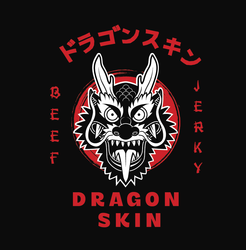
Evolved Packaging Concepts – U.S. Market with Japanese Influence
These updated packaging sleeves reflect a refined design direction based on the client’s request to evoke the look and feel of a product made in Japan but sold in the U.S. market. Japanese characters were integrated with contemporary layouts to strike the right cultural balance.
Typography, iconography, and layout decisions were made to retain authenticity while ensuring shelf appeal to American consumers. This iteration was a step toward finalizing a visual language that communicates the product’s heritage, quality, and uniqueness.

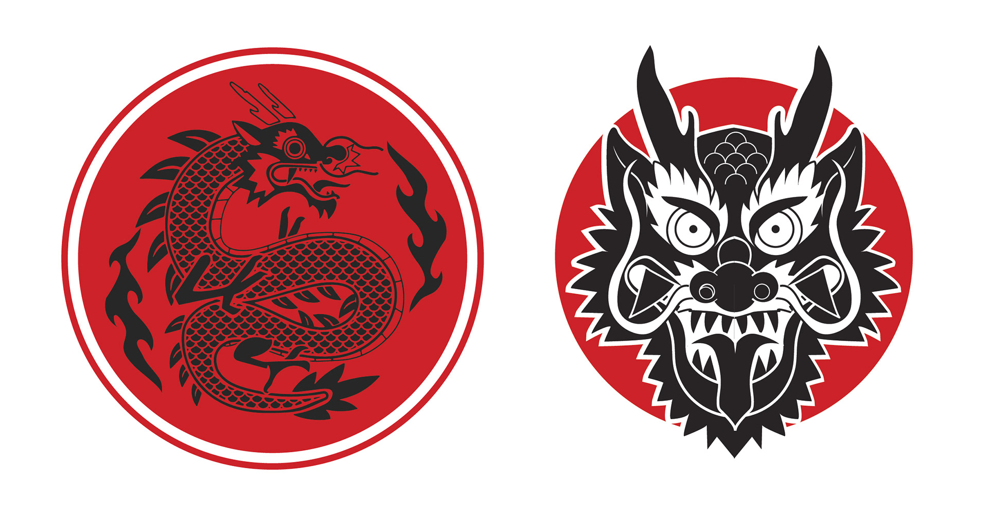
Logo & Branding Explorations – Early Design Development
This section shows early logo concepts, along with explorations of typefaces, color palettes, and graphic styles. Each draft was part of a broader effort to uncover the right voice for the brand.
The process involved balancing traditional Japanese aesthetics with modern branding cues, ultimately leading to a final mark that captures the spirit of the jerky: handcrafted, heritage-inspired, and distinctly memorable.